Wedding Stationery Suite
Graphic Design
The Challenge
Since many of our wedding guests would be visiting California for the first time, I wanted to design a cohesive wedding stationery suite that embodied the colors, sights, and beauty of CA Route 1. The ceremony, dinner, and accommodations were all at picturesque locations along the coast, and highlighting them with custom iconography was like a fun way to get our guests excited about the day’s journey.
The Scope
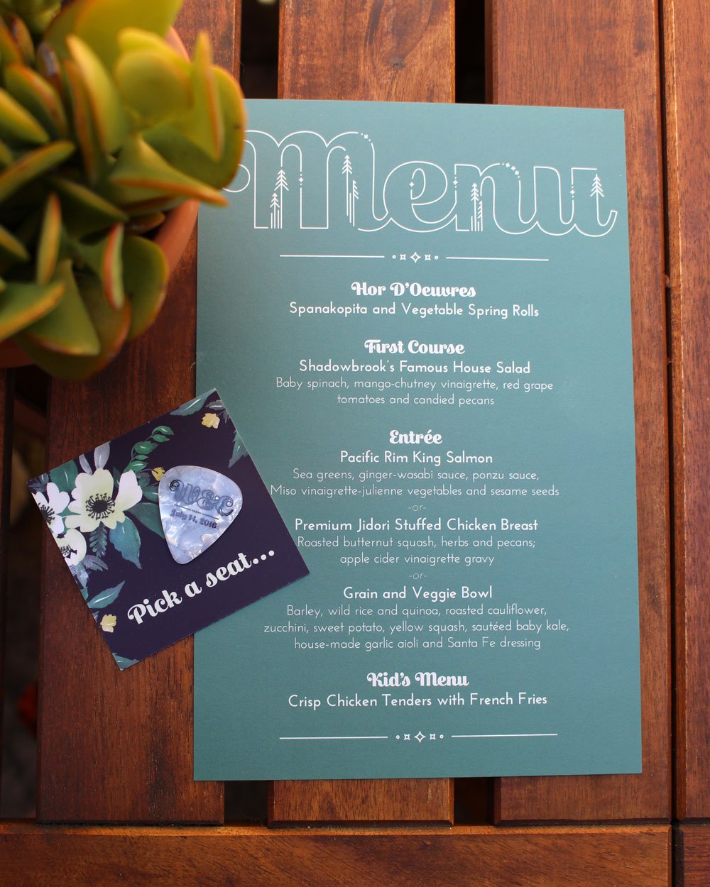
I needed to create the invitation, RSVP card, and an additional itinerary card to be sent to guests in the mail. I also created the menu and a seating guide with favor attached - a custom-printed guitar pick. To complete the design, I created monogrammed letters and headings representing California’s natural coast. I also designed custom icons that represent the locations used in the ceremony and reception.


What I Learned
The stationery suite required quite a few custom icons. One of my most important takeaways from this project was the fact that even through line widths are technically equal, they may not be visually equal. It became very important to step away from my computer to view the printed icons from a distance.
For this project I had to set creative boundaries early on, and develop a cohesive visual plan prior to putting pen to paper. Being your own client is truly a learning experience.


